How to Combine Colors in Your Wardrobe.
Combining colors is a science! …but something that can be learned. You see a man or woman putting together an outfit that stands out not because of the fit and fabric but because of the really catchy combination of colors and you’re wondering how they did it.
Well, you know it’s my job to hook you up with information that will help you step up your title as a ‘Stylista’ and if you want more information, do not forget you could always email or call me up if you live in Abuja or Nigeria to do a more intense color analysis for you and your wardrobe.

A Personal Color Analysis is a complete check of a person’s color season (Deep/Light/Medium Autumn, Winter, Spring and Summer), what colors on the color wheel (remember the color wheel from arts class? yes, one and only) best suit that person’s skin color and how to match colors in this color season to produce outfits that agree with that color season.
Notice how you dress up sometimes and people ask you if you’re ok? ill? well, if you really are not ill, then it’s because the colors do not go with your skin tone and has either ended up making your skin look dull or sickly. Sometimes you go out and everyone comments on how great you look and how you look good in that color? yes, that’s one of your season’s color. Much as these are all required in choosing an appropriate wardrobe for yourself, it is far from realistic to follow this strictly as you as well know that there are colors you like that may not agree with your season’s colors and you definitely will not stop wearing them. What you do then is learn to combine these colors in ways that still make you look good or in tones that bring out your good side.
So let’s not get confused or in my case confusing, i’ll just give you a few guides to knowing how to mix and match colors OK?
First we have to know that in dressing, we have neutral colors which we can combine with most of these colors on the color wheel. They are black, white, grey, dark brown and dark blue. For men however, be careful because with a blue suit for instance, there are some colors that just won’t go so for the more flattering contrasts and accents, try orange based tones but for harmony, pick colors in the same color family.

The Color Wheel
It’s really about how you see colors and what colors are can be pleasing to the eyes when combined. You need to know the primary, secondary and tertiary colors. we use these colors everyday but going further, you need to consider that these colors have Value (the lightness or darkness of a color, this is what makes sky blue different from navy or dark blue), Hues (red, blue etc, basically the color, the colors in the color wheel are made of hues and in different temperatures- warm as in red, orange, yellow or cool as in blue, blue-violet and purple.) and the Chroma (the purity of the color- clarity, intensity, brightness or dullness of a hue e.g yellow and mustard or lemon.)

With these you can create a color scheme( a mix of colors in hue, value and chroma) that makes it pleasing to the eyes, interesting and varied:
Achromatic (Black, white and grey)


Monochromatic (colors from one hue adding black, white or grey or other colors creating a safe but harmonious effect.)


Complementary (combining colors opposite each other on the color wheel giving you a bold contrasting feel to your outfits.) e.g red and green, blue and orange or yellow etc. Complementary colors have the same components of the 3 primary colors which in effect bring equilibrium to the eyes because the primary colors are a natural complementary color combination but because they have a tendency to be too intense to the eyes, I would recommend you use intermediate colors like red- orange and blue- green.
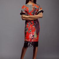
To create a more sophisticated palette, use complementary colors in darker hues also like mustard and violet or cobalt blue and burnt orange (see my styling examples below):


Combined Harmonious (using complementary colors and then livening them up with accents- Accents are highlights in small quantities with a high purity of color often complementary to the main color; to create an exciting effect).
For men, accents can appear in choice places like:
- Neckties are the most common accent for men. They look best when they are either from a similar color family as the shirt beneath them (lavender tie over a light blue shirt, for example) or a complementary color for contrast (such as a burgundy tie over a white-and-green striped shirt).
- Pocket squares are like neckties in terms of decorative function, but are far less widely used. Include one in your outfits to add a bit of stylish flash. They should pair with the suit jacket or sport coat in much the same way that the necktie pairs with the shirt: either joining it in a similar color scheme or contrasting with it in a complementary fashion. When wearing both, be aware that the necktie and the pocket square should never match — they are two separate accents!
- Jewelry should generally be understated on a man. The basic rule of thumb is to keep all the metals matching: either gold tones or silver, never both. Watches, rings, cufflinks, and earrings if you wear one all fall under the rule. The only exception is a wedding band, which can be worn with anything — its significance is recognized to be set apart from the rules of fashion. If you do happen to wear colored jewelry (unusual on a man), be sure that the colored stone/glass either contrasts or mimics the colors of the larger outfit in the same way as the other accents.
- Briefcases and other bags are rarely a perfect match (unless you happen to have the money for a matching bag with each suit and shirt). Most men find it easiest to own a black bag and a brown bag and match the bag to their shoes and belt. Blue-tone canvases do well with brown leather, more neutral bases go best with black, and brighter colors may go with one or the other depending on where they fall on the color wheel.
- Glasses can be particularly frustrating if you need to wear them daily and only own one set of frames. Any kind of distinct color will be a jarring note in outfits that don’t go well with that particular color. Try to stick to narrow frames with a muted metallic or black color if you’re planning on wearing your glasses with all of your outfits.

Analog/Harmonious (colors that lie side by side on the color wheel. You can see them everywhere in nature- green and yellow plants, red and yellow sun etc. They come from a common hue when mixed in the color wheel.


Triad (3 colors on the color wheel that are equal distances from each other but balances the eyes)

Not all your outfits will follow the color wheel relationships rigidly. Worry not if they don’t, instead look for combinations that you feel comfortable in, using the color wheel schemes as a very basic guideline. Personally I prefer to do 3 colors at most a time, nothing more but know that a splash of difference here or there is what makes the outfit yours. A basic understanding of the color wheel is just a tool to get you started. And hopefully I’ve helped out with that!
Remember, if you want a personal consult, send an email OK?
hugs :))
Molekor
Credits:www.realmenrealstyle.com, colorsontheweb.com, tigercolors.com